
The 90s Design Aesthetic: Bold, Gritty, and Effortlessly Fun

Updated: Mar 22
The 1990s didn’t try to be polished—and that’s exactly what made the decade iconic. 90s design was raw, expressive, and confident enough to break the rules without asking permission. It pulled inspiration from street culture, music, fashion, and analog imperfections, creating visuals that still feel fresh today.
Bright Intense Colours, BUT Not Neon
The 90s loved colour, but not the glowing, synthetic neon of the 80s. Instead, the palette leaned into rich primaries, punchy secondaries, and unexpected combinations. Colours were bold but grounded—often layered with texture, grain, or film effects that gave them depth and edge.
These palettes felt playful and rebellious without being glossy.
Plaid, Patterns, and Controlled Chaos
Plaid was everywhere in the 90s—from fashion to editorial design—and it absolutely shaped the visual language of the decade. Mixed with stripes, checks, or collage elements, plaid brought a sense of attitude and structure at the same time.
Designers weren’t afraid to clash patterns, overlap elements, or let layouts feel slightly off-balance. That tension is what made the work feel alive.

Cross-Processed Film: Imperfection as Style
Cross-processed photography became a defining look of the 90s. What started as a chemical shortcut turned into an aesthetic choice—producing odd colour shifts, high saturation, deep shadows, and unpredictable results.
Skin tones went warm or green, highlights bloomed, and shadows crushed. The imperfections added mood and authenticity, making images feel gritty, emotional, and unmistakably of the era.
Extreme Contrast, Strong Attitude
90s design embraced hard contrast. Deep blacks against blown-out whites, bold type against textured backgrounds, and sharp edges paired with raw photography.
Typography was oversized, heavy, and often experimental. Kerning rules were bent. Alignment was optional. The message mattered more than refinement, and clarity mattered more than elegance.
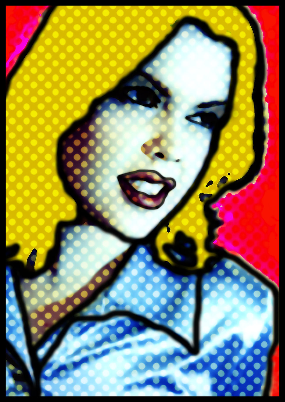
Fun Without Apology
The 90s weren’t ironic—they were sincere and expressive. Design was allowed to be playful, messy, and weird. Hand-drawn elements, cut-and-paste aesthetics, unexpected humour, and visual noise were all part of the charm.
It wasn’t about perfection. It was about personality.
Why the 90s Aesthetic Still Resonates
In a world dominated by clean lines and muted palettes, 90s design stands out for its warmth, texture, and human feel. It reminds us that design doesn’t have to be sterile to be effective.
Today’s revival pulls from:
Bold, grounded colour palettes
Plaid and layered patterning
Analog textures and film grain
High contrast layouts
Playful, expressive typography
Because sometimes the best design doesn’t aim to be timeless—it aims to be memorable.
#90sDesign #90sAesthetic #DesignInspiration #GraphicDesign #RetroDesign #CrossProcessedFilm #BoldColors #ExtremeContrast #PlaidDesign #CreativeDesign #VisualDesign #DesignTrends #ThrowbackDesign #FunDesign #90sVibes #DesignCommunity #RetroVibes #DesignMood #ColorfulDesign #DesignLife
Follow us:
Check out our links and discover how we can elevate your brand!
#BurlingtonON #BurlingtonOntario #GTAbusiness #CreativeRetainer #DesignRetainer #GraphicDesignBurlington #SeniorDesigner #CreativeAgency #DesignAgency #MarketingSupport #BrandConsistency #DigitalDesign #ContentCreation #SmallBusinessMarketing #EntrepreneurLife #CBirdCreative #HireADesigner #OnDemandDesign #MarketingDepartment #BusinessGrowth


Comments